
Ofisim Media is a creative agency offering web design, SEO and digital marketing services for your brand.
Ofisim Media is a creative agency offering web design, SEO and digital marketing services for your brand.
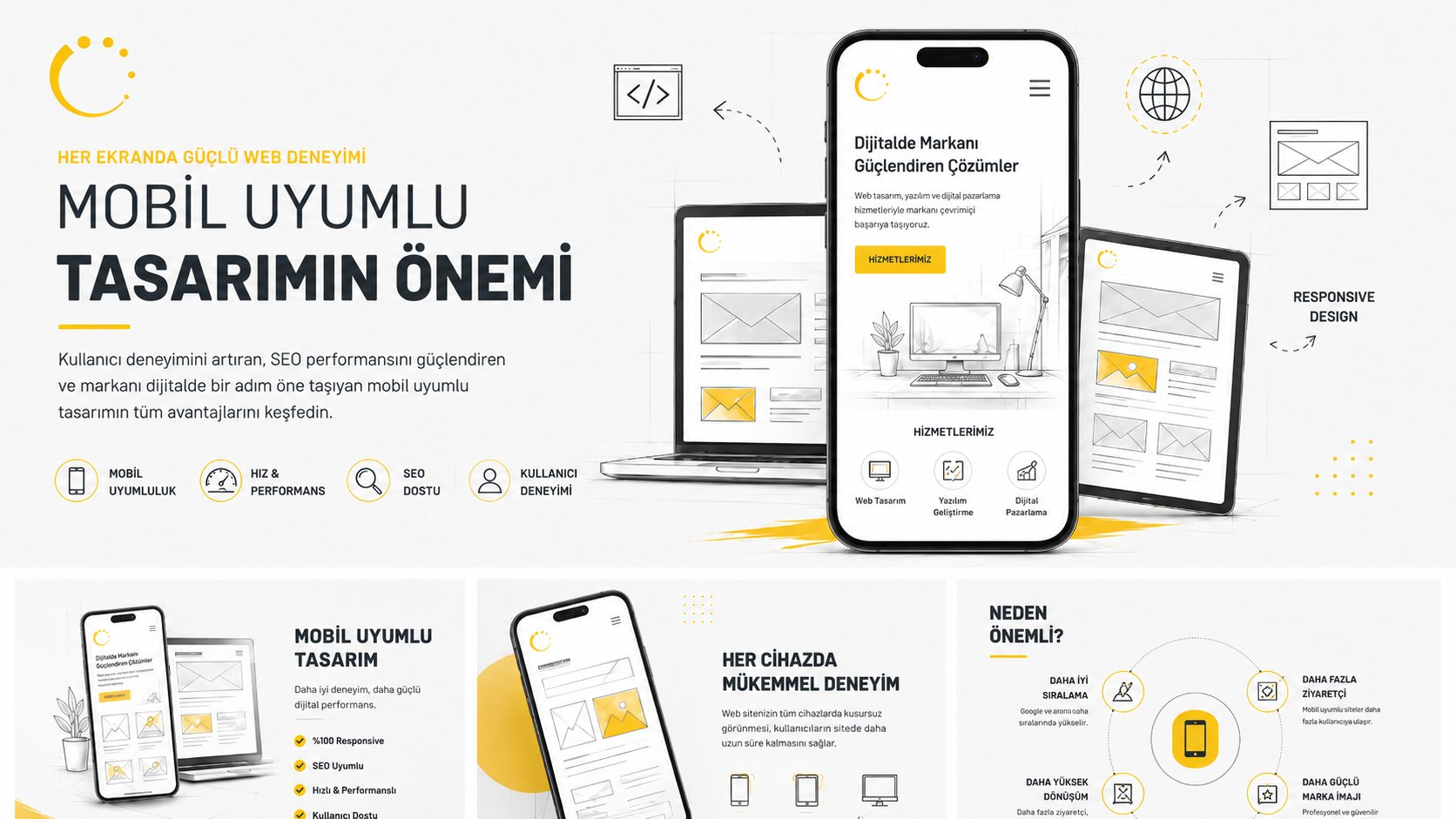
In the digital world, the way users access websites has changed significantly. Today, many visitors discover a brand for the first time not through a desktop computer, but through a smartphone or tablet.
In the digital world, the way users access websites has changed significantly. Today, many visitors discover a brand for the first time not through a desktop computer, but through a smartphone or tablet. For this reason, mobile-friendly design is no longer just a technical preference; it has become a fundamental requirement for user experience, brand perception, and SEO performance.
A website that loads quickly on mobile devices, is easy to read, simple to navigate, and helps users reach the right information without effort plays an important role in digital success. As of 2026, website performance is not only about visual appeal; speed, accessibility, content structure, and mobile experience quality are becoming increasingly important.
Mobile-friendly design is an approach that allows a website to display correctly across different screen sizes. With this structure, a website can offer users a consistent, readable, and functional experience on desktop computers, tablets, and smartphones.
On a mobile-friendly website, texts are easy to read, buttons are easy to tap, visuals are positioned properly according to screen size, and menus work without making navigation difficult for users. In other words, mobile compatibility does not simply mean that a website opens on a phone; it means that visitors can move through the website comfortably.
Why Is Mobile Experience Important for Google?
Google evaluates websites with an approach that places user experience at the center. As mobile traffic continues to increase, a website’s mobile version has become even more critical for SEO performance.
If a website’s mobile version contains missing content, loads slowly, includes broken design elements, or has a navigation structure that makes the user experience difficult, its search performance may be negatively affected. For this reason, content consistency, technical accessibility, and page experience should be considered together across desktop and mobile versions.
A mobile-friendly structure helps Google crawl and understand the website more efficiently while also encouraging users to spend more time on the site. This creates a stronger foundation for organic visibility.
Mobile users usually make decisions quickly. A website that loads slowly, looks confusing on the screen, or prevents users from reaching the information they need can cause visitors to leave the page.
A well-planned mobile design guides users in the right direction. The menu structure is simple, contact buttons are visible, texts are easy to follow, and the page flow feels natural. This helps visitors build a stronger connection with the brand.
Mobile compatibility also affects trust. A website that looks professional, works quickly, and appears consistent on every device contributes to a stronger and more reliable digital brand perception.
One of the most important parts of mobile-friendly design is page speed. Users do not want to wait on websites that load slowly. That is why image optimization, clean code structure, proper server infrastructure, and lightweight page design are highly important.
Google’s Core Web Vitals metrics focus on areas that directly affect user experience, such as loading performance, interaction speed, and visual stability. Therefore, mobile design should not be seen only as a visual process. Technical performance is an essential part of SEO success.
Mobile pages that load quickly, work smoothly, and provide a stable experience support both visitor satisfaction and search engine visibility.
For a successful mobile web experience, design, content, and technical infrastructure should be handled together. Page layouts should be simplified for smaller screens, content should be divided with clear headings, and users should not be overwhelmed with unnecessary details.
Buttons should be large enough to tap easily, forms should be short and understandable, and visuals should open properly on mobile screens without distortion. In addition, the mobile menu structure should be simple, accessible, and easy to use.
Important content available on the desktop version should also be included on the mobile version. Content that is missing on mobile can negatively affect both user experience and search engines’ ability to understand the page.
A mobile-friendly website provides brands with more than just a technical advantage; it also contributes to sales, communication, and trust. Users spend more time on websites where they can navigate comfortably, review services more easily, and take action with greater confidence.
Especially for service-based companies, mobile experience is one of the first contact points with potential customers. Easy access to actions such as phone calls, WhatsApp directions, quote forms, or location information on mobile can help increase conversion rates.
In short, mobile-friendly design does not only make a website look more modern; it helps a brand appear more accessible, reliable, and professional in the digital world.
Mobile-friendly design is one of the essential requirements of a successful website in 2026. Since many users reach brands through mobile devices, a website must work quickly, consistently, and clearly on every screen size.
From an SEO perspective, mobile compatibility is directly related to content structure, page speed, user experience, and technical performance. Therefore, mobile design is not just a visual improvement; it is a strategic investment that supports digital visibility.
At Ofisim Media, we approach mobile compatibility in web design and development processes not only as a technical standard, but as an integrated structure that strengthens user experience and brand perception. Because a well-designed mobile experience helps brands become more visible, more accessible, and stronger in the digital world.